Build a creative portfolio site using React + Tailwind + Framer Motion. The vibe is minimalist editorial — heavy serif typography, generous spacing, dark mode by default.
PAGES (single-page sections)
1. HERO — full viewport. Name in huge serif italic (clamp 80px-160px). One-line tagline below in sans-serif uppercase tracking-widest. No CTA, just a small arrow scroll cue at the bottom.
2. ABOUT — two columns desktop / one column mobile. Left: portrait image (rounded corners, 16:9). Right: paragraph (~120 words) about the creator, then 4 skill tags as pills.
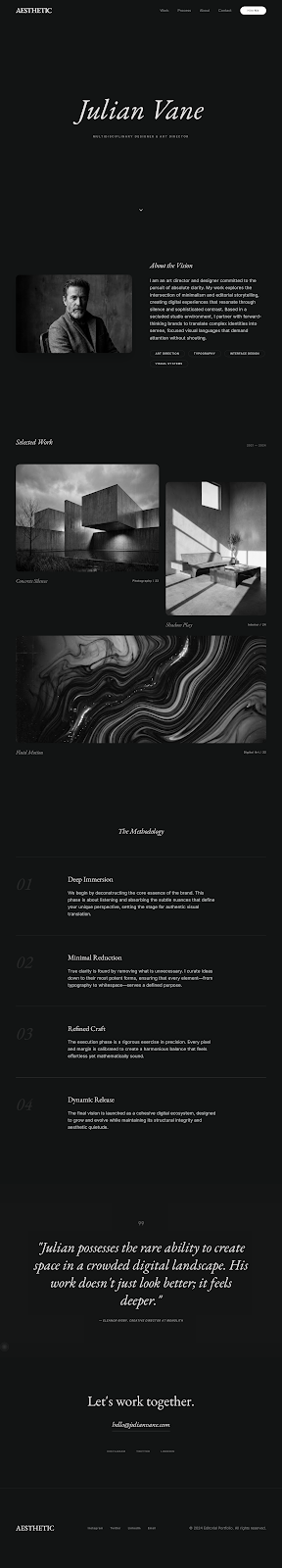
3. SELECTED WORK — masonry grid (3 columns desktop, 2 tablet, 1 mobile). Each item: image (varied aspect ratios), project name + year overlay (appears on hover). Click opens a modal with project details.
4. PROCESS — 4 numbered steps in a vertical list. Each step: huge number in serif italic on the left, title + description on the right.
5. TESTIMONIALS — single column, centered. Each quote stands alone with generous whitespace between. Italic serif quote, then small attribution.
6. CONTACT — large heading 'Let's work together.' followed by email link in serif italic (mailto:), social icons row below.
DESIGN
- Background #0a0a14, text white, muted rgba(255,255,255,0.6)
- Serif font: Cormorant Garamond or similar. Sans-serif: Inter.
- Section padding: 160px top/bottom desktop, 96px mobile.
- Max content width 1200px, centered.
- Images: rounded-2xl, subtle grayscale filter by default, returns to color on hover.
MOTION
- Each section's heading fades in from y:40 when 50% into viewport
- Project grid items stagger in with 80ms delay each
- Mouse-following subtle cursor highlight (radial gradient that tracks cursor at low opacity)
- Page transition: section anchors smooth-scroll with 800ms duration
📸 Örnek Görsel
Tam boy görmek için tıkla ↗